
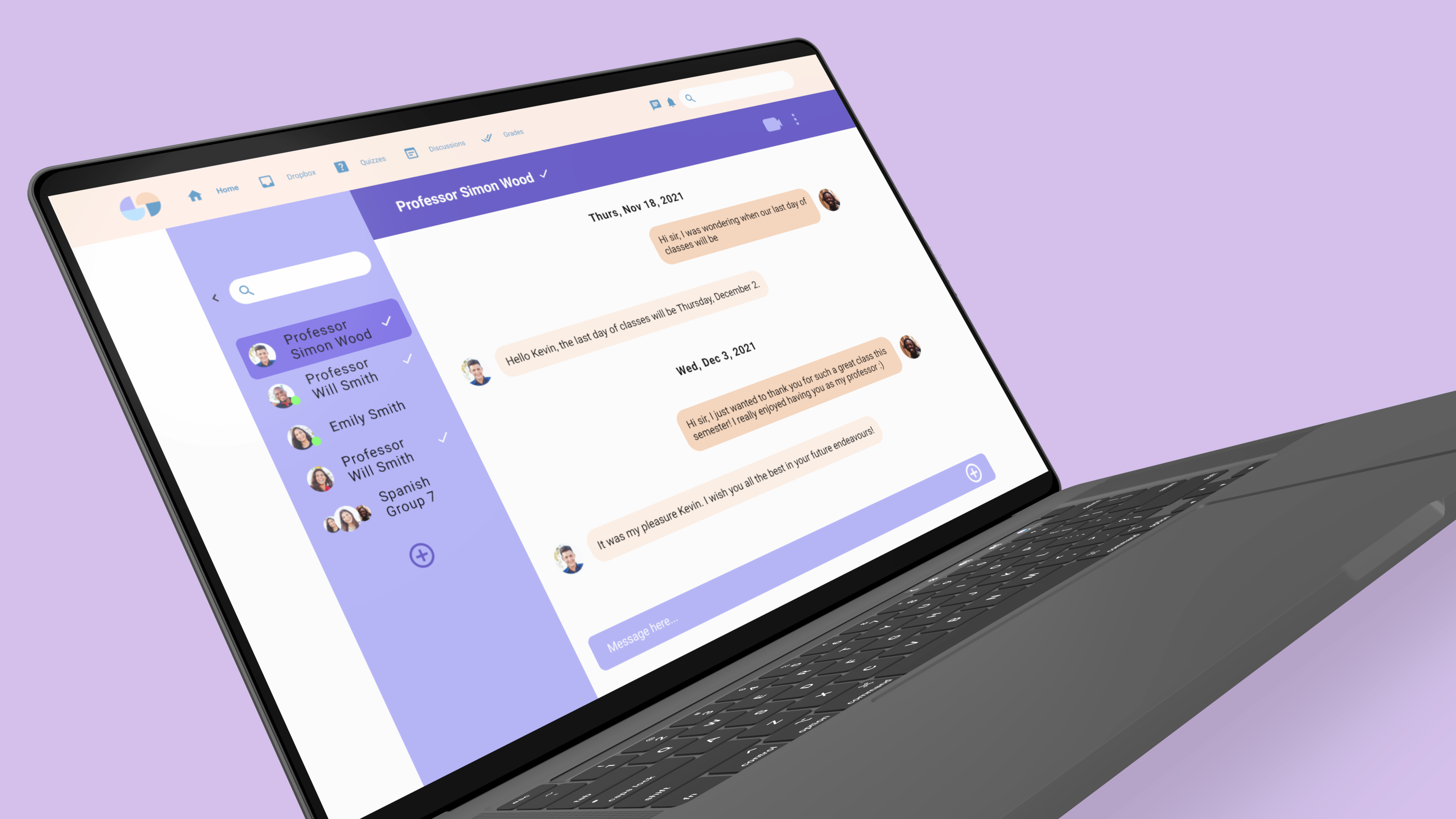
simple communication between teachers and students
Project Type: UI/UX, Website Design
Role: Educational Systems Designer
Tools: Figma, Miro
Timeline: Sept - Dec 2021
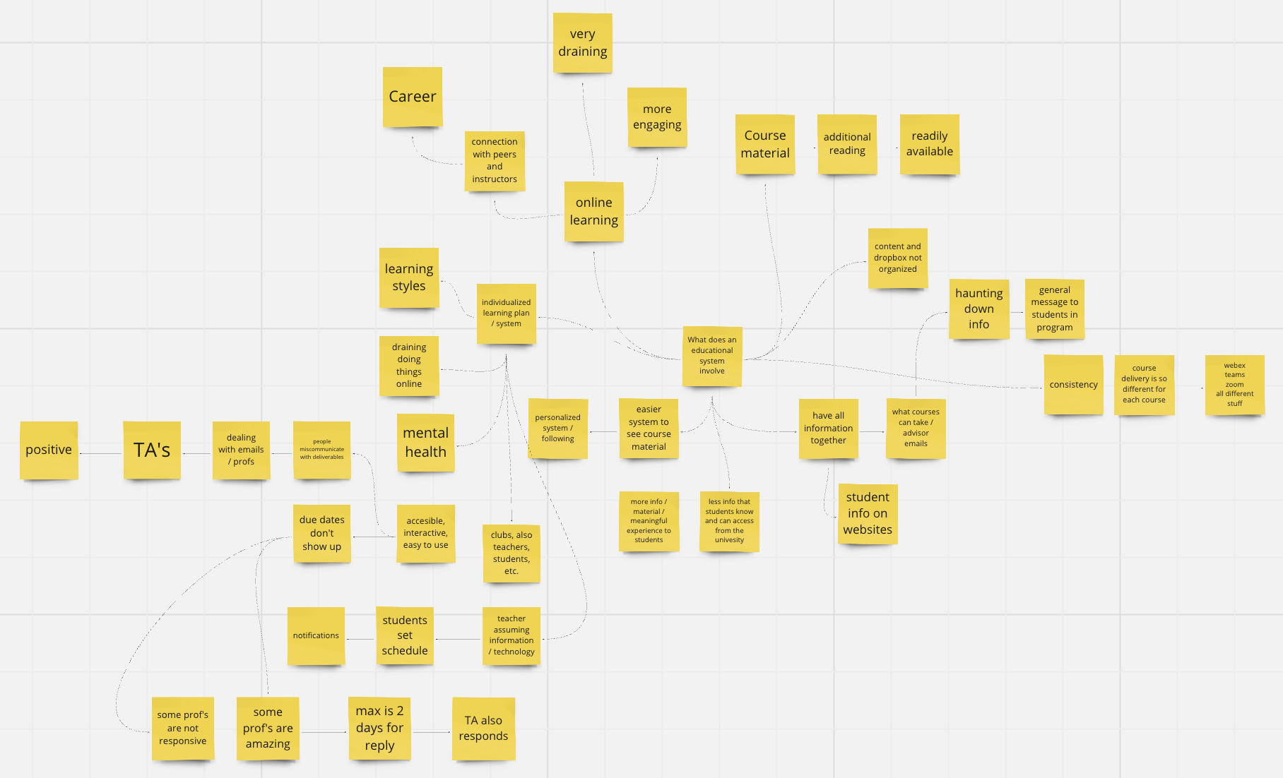
In order to define our problem space, our team created a mind map of what an educational system entails and what the key factors are. Online learning platforms can be unorganized, hard to use for both students and teachers. Students end up having to use multiple online platforms for certain courses and it can be hard to communicate with professors at times.
Mind Map
Studium is an organized, engaging, and all-in-one online learning platform. Within 4 months, I collaborated with 4 other team members to research and build a better educational system for students and professors.
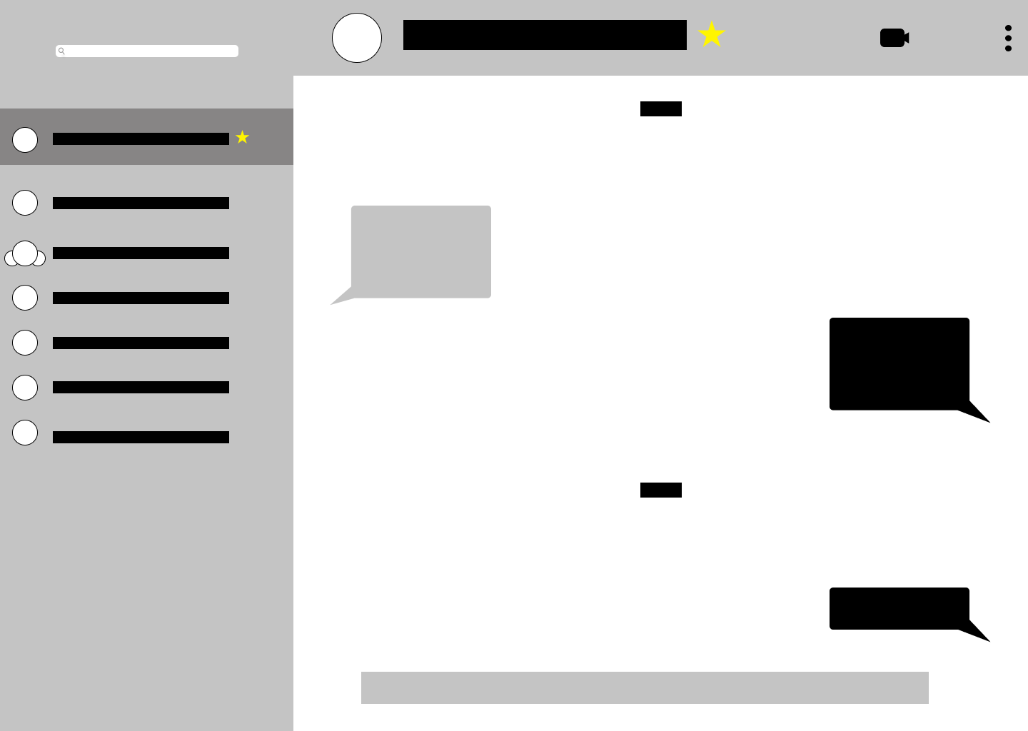
I was actively involved in all aspects of the UX process and I was in charge of designing the direct message and video call interface wireframes and mockups on Figma. I attended weekly meetings to collaborate with my design lead and three other designers to provide thoughtful feedback and discuss next steps.
We conducted user research on students through Google form surveys and consulted professors at the University of Waterloo in order to gain a deeper understanding of the problem space and insight into user needs.
RESEARCH FINDINGS
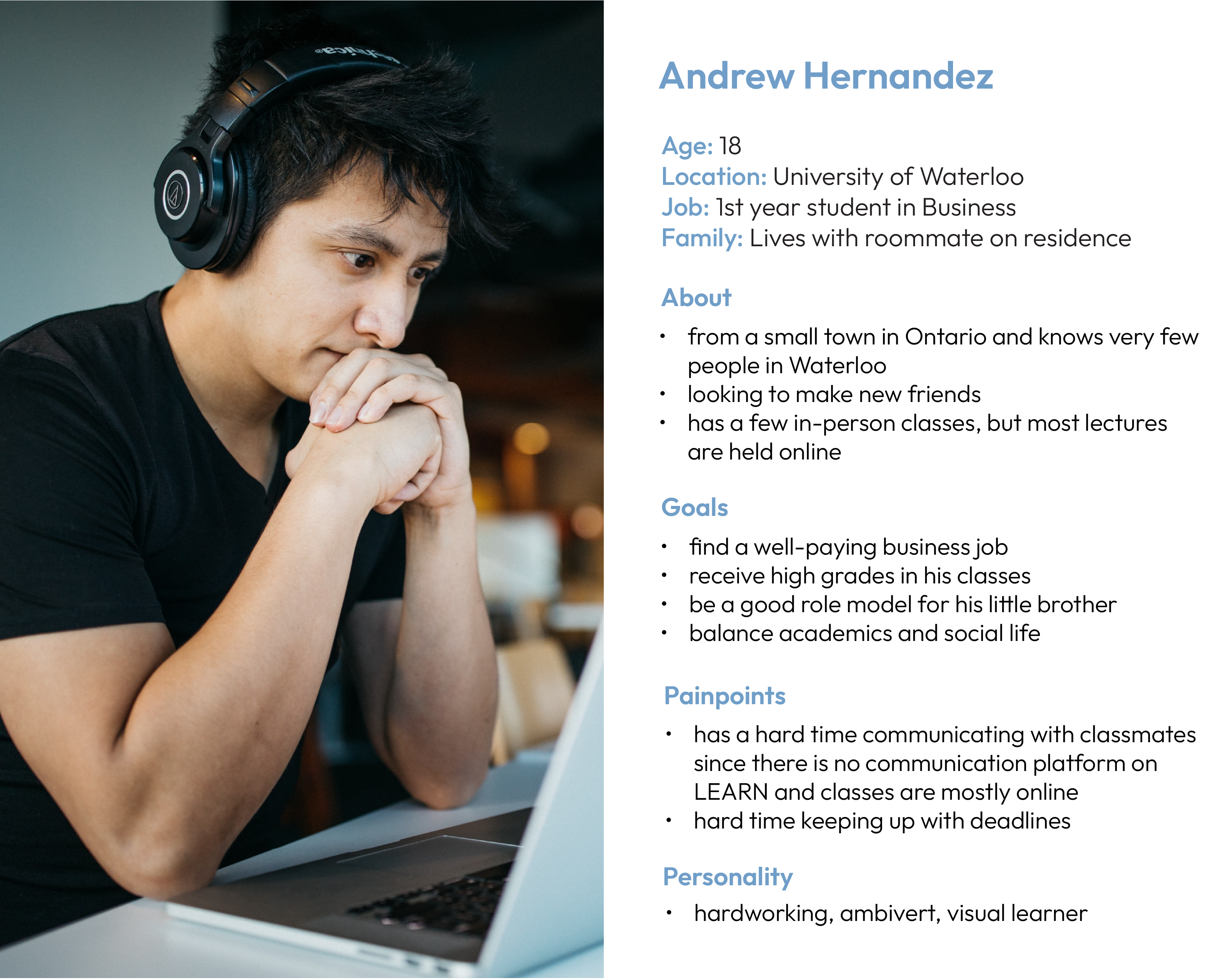
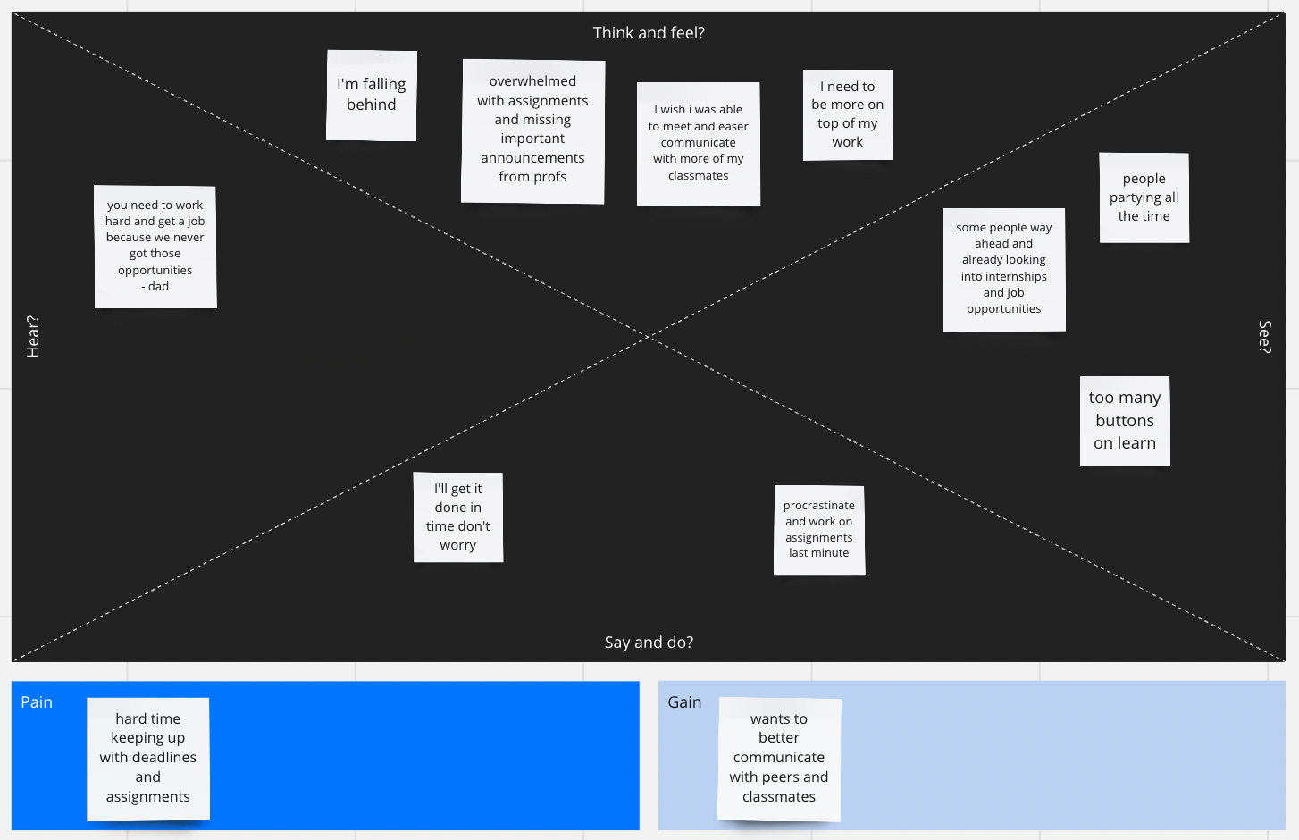
USER PERSONAS
We also created user personas and empathy maps of students and professors to better understand our audience and their pain points.
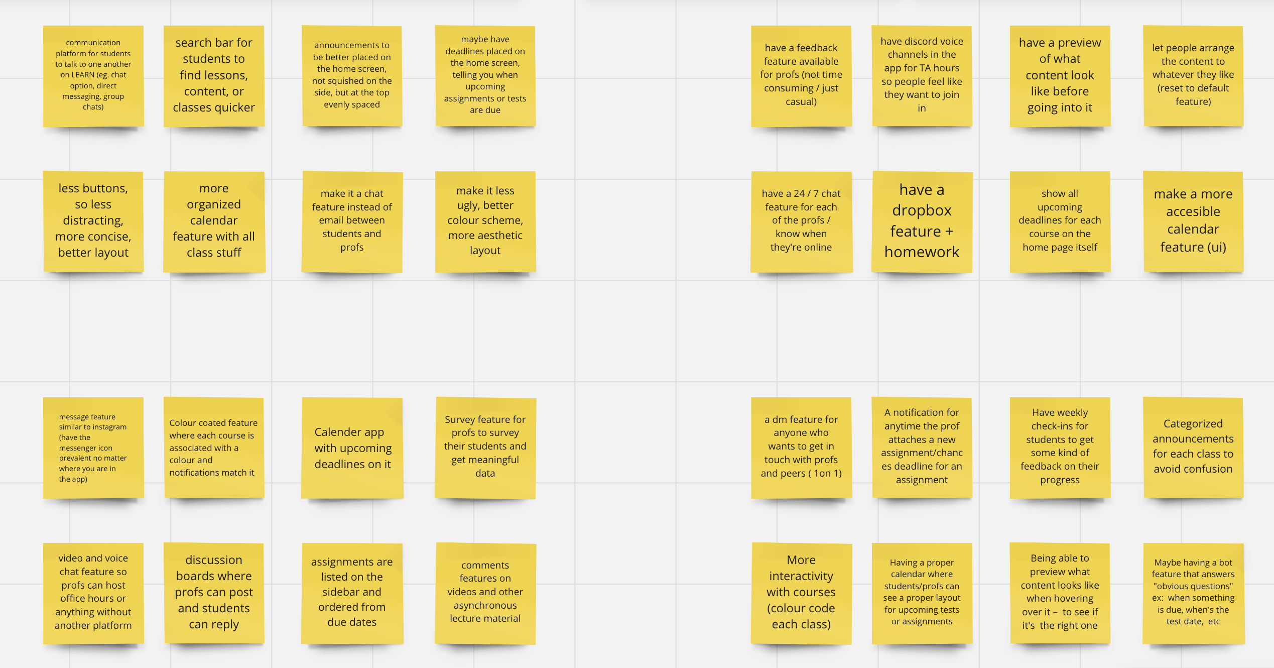
Based on our research, we rapidly ideated possible features for our website using the Crazy 8s brainstorming technique. The features we decided to include in our online learning platform were video and voice call features, as well as direct messaging in order for students to easily communicate with other students and professors. We collaboratively designed low and medium-fidelity wireframes on Figma.
Crazy 8s Brainstorming
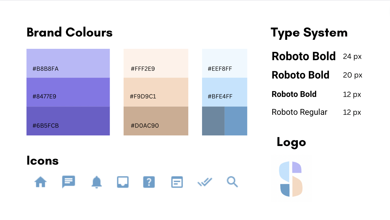
Our team created a visual design system and a brand that we adhered to in order to have a cohesive website. We named our website app "Studium" which means study in latin. Our brand values accessibility, ease and organization in an all-in-one platform.
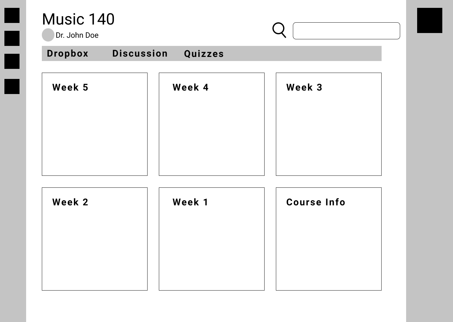
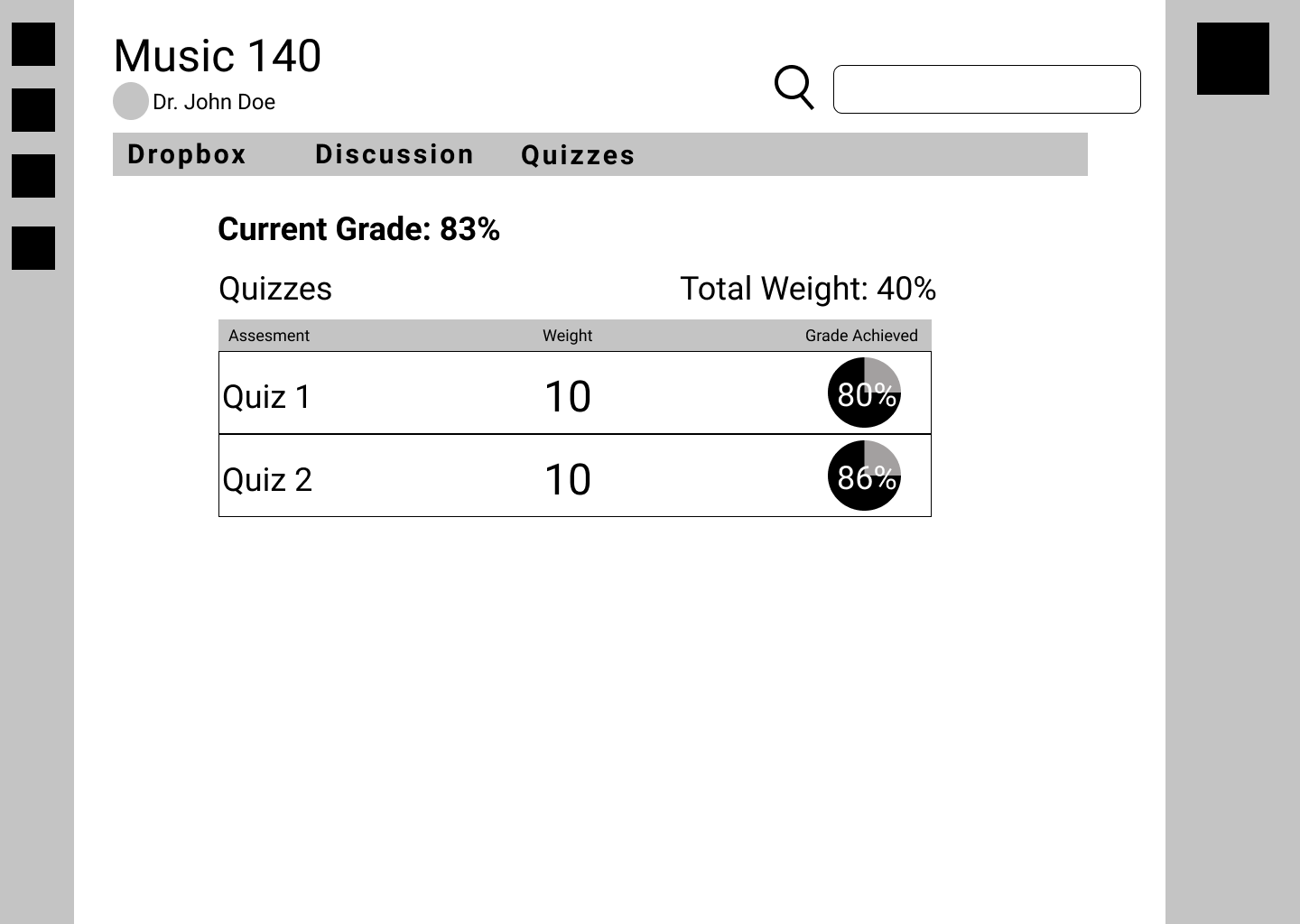
Our website was designed and prototyped on Figma and here is a short demo of our app.
1. Figma Proficiency
I gained valuable insights from other designers who taught me how to use Figma more effectively and streamline my design process.
2. Research and ideation techniques
Throughout this design process, our team used various methods in order to explore creative solutions and refine our designs to ensure the final product met both user needs and project goals.